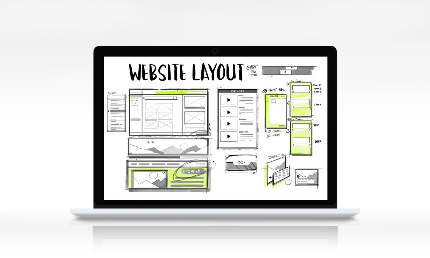
One thing you must keep in mind when setting up your blog is the blog/website structure.
I will liken this very much to how an Architect lays out the floor plan of a building. It is how you draw in a reader, taking them through your blog until they decide to leave.
In this post, I will show you the basics of what you need to create a structured blog.
When you land on the home page of a typical blog, the first thing you see is the blog logo. Next will be the navigation menu (appears as a hamburger menu for mobile phone users), probably a search bar or button, a general introduction, some blog posts and then social media handles at the bottom of the scroll.

If you followed the typical example I just gave, then I will tell you that every blog or website is structured to have a header, hero section, body, pages, and the footer. Where and how you place them is dependent on your layout style.
The layout structure I’m teaching you here is for your homepage. You can also decide on how your blog post pages will look like if you do not like the default settings given to you in WordPress.
The Header
This is the topmost part of the blog structure. It is the first place a reader will look at for a guide on how to move around your blog beyond the page they landed on.
A typical header contains the blog logo. This blog logo is attached to the link of the home page of your blog. A reader who lands on your page through a blog post will often click on this logo to go to your homepage.
The header also contains navigation menu, which consists of standalone pages. These standalone pages include the About, Contact, Privacy, Terms or a Sales Page.
A search button (usually looks like a magnifying glass) or a search bar is also found at the header section. This allows readers to conduct a simple search on your blog to find an old post or anything they might be looking for.
The Hero Section
This section is located below the header. Some blogs have it, some don’t. Your choice.
It usually contains an introduction, a subscription call or a sales call-to-action. It’s meant to make your reader’s take notice of something and then take an action.
The hero section is designed in such a way that the reader who comes to your page sees it first before they start scrolling. This is usually referred to as “above-the-fold”, because of the effect of seeing it, before scrolling begins.
The Body
This is the body of the blog homepage. Here you can add your latest blog posts or segment them based on your blog post categories. Some blogs also use this segment to advertise other services they have. Some place testimonials here and companies they have worked with.
The Pages
These are standalone pages that are used for conveying any message you want to specifically put on a page for your readers. The page links can be placed in navigation menu or within the body of the homepage.
The Footer
This is the bottom part of the blog structure. It’s usually the end of the scroll.
It consists of other links in your navigation menu that you did not put on the header section. It could be links to a course, a social media link or a link to send you an email, or a WhatsApp chat.
You can also include your copyrighted messages, disclaimer messages, and physical address here, if you wish your readers to find and visit your office.
***
You can draw this out on a paper, placing all elements where you want them to be before you start the actual layout design online. I hope this helps you in structuring the design look of your blog.
Should you desire to edit your typical blog post page, follow the same principle.
A typical blog post layout starts with the Post title → Post Information (includes categories, author, date, read time, comments, disclaimers, etc.) → Share buttons → Post Body → Conclusion → Comment box → Share buttons → Author box → Related Posts
It’s not a must to follow the layout as written, this is what I just found on most blog posts.
Want to use the Elementor page builder for editing your homepage? Learn how to edit your home page using Elementor.
***
Happy blogging…


